Feedback from Testing Session
User Feedback
Testing was performed with 3 participants, one at a time. I watched them without comment to see how they would progress through the game, and then presented them with a questionnaire with the following questions:
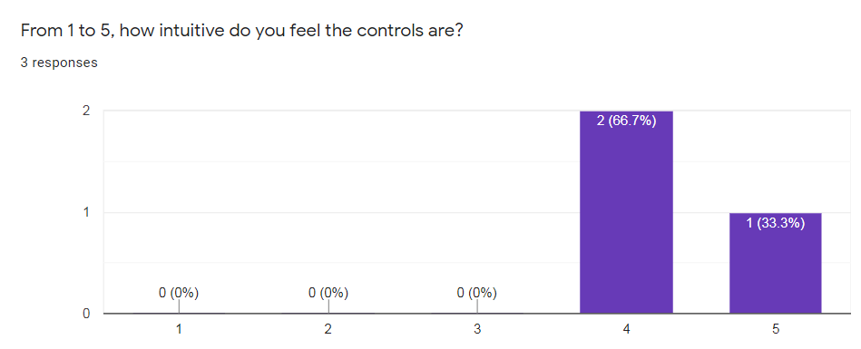
- From 1 to 5, how intuitive do you feel the controls are?
- Does the concept / theme interest you? If yes, why? If no, why?
- From 1 to 5, how responsive does the game feel?
- Did you encounter any bugs or aspects of the game that you think need addressing? If yes, please provide some details.
- With regards to 2D platformers and how they feel to play, how would you rate this game?
- Do you think you'd prefer starting each level with no powers and finding them in the level, or do you think you'd prefer starting each level with the powers you've collected and collecting new powers throughout the game? Why?
- What kind of challenges sound most appealing?
- How do you feel about comboing moves together, like being able to place a sand block down and then being able to dash through it to go further than a regular dash?
- Please indicate your feelings for the project (1 = I am not interested, 5 = I am interested)
- If you have any feedback or comments that you would like to share but that didn't fit in another question, please provide it here.
So now, question by question, let's address the feedback.
Question 1
From this we can see that the control scheme felt largely intuitive for the people in the testing session, which I am pleased with. I aimed to create an intuitive/tight feeling control scheme to go alongside precision platforming gameplay. There is some indication that the intuition of the controls could be improved, which I think may be due to the special abilities being mapped to the arrow keys, which are traditionally seen as movement keys. I think to address this in future, I might change the abilities to be mapped to a set of keys that are less related to movement in most people's minds, such as l;'p or maybe M<>?
Question 2

This feedback seems to be generally positive, and I am particularly pleased that the idea of adding extra mechanics in the form of unique moves seems to interest one of the respondents.
Question 3
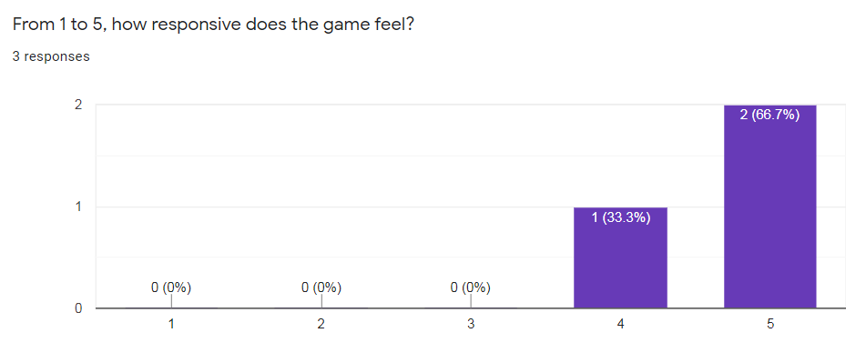
From this feedback we can see that the game generally felt very responsive for the people in the testing session. I suspect the '4' rating may be from the UI in the top right not being perfectly clear about when an ability is ready to be used again. To address this in future, I might make it so that when an ability icon is done fading back in and is fully ready to use, the icon might pulse briefly to a larger size and play a sound effect, so that it is absolutely clear when the ability is done recharging.
Question 4

Here we can see that I forgot to add killzones/teleporters to the far right and far left of the level. This has been remedied, and it is now impossible to fall forever off the ends of the levels.
Question 5
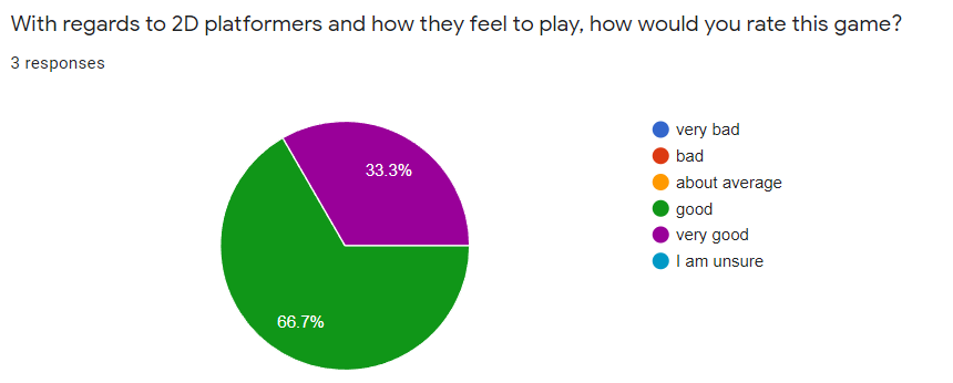
Here we can see that the feel of the game was rated relatively highly by the testers. In future development, I would aim to repeatedly ask this same question, perhaps on a more granular level, and always aim to improve the proportion of people rating the game's feel as 'very good'. Consistent testing is key to ensuring a good feel.
Question 6
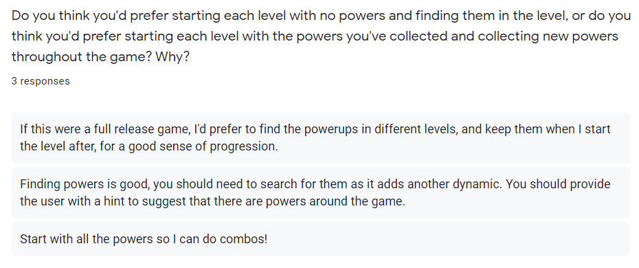
We appear to have conflicting responses to this question, which makes gauging the direction to take the game in difficult. By my own gut, I'd agree with the response at the top, but I think I would need to take a larger number of responses before fully deciding if I should go with my own intuition or not.
Question 7
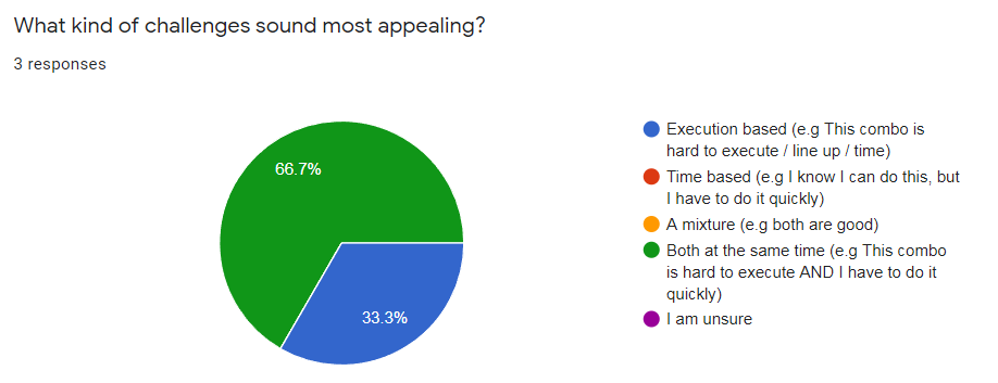
It appears that we have a mixture of responses indicating that some people like execution and time based challenges, while some people prefer only execution based challenges. To address this, if this trend was seen in larger scale testing, I think I might implement an optional time trial mode to let people who don't like time pressure still enjoy the main game, while also letting people who like the extra time pressure challenge themselves.
Question 8
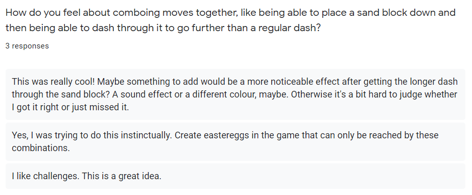
I am glad that the response to comboing moves together was entirely positive, and included specific mention of easter eggs accessible by these combos. I would definitely do something similar to what the response at the top recommends, as adding visual distinction and clarity is bound to be useful.
Question 9
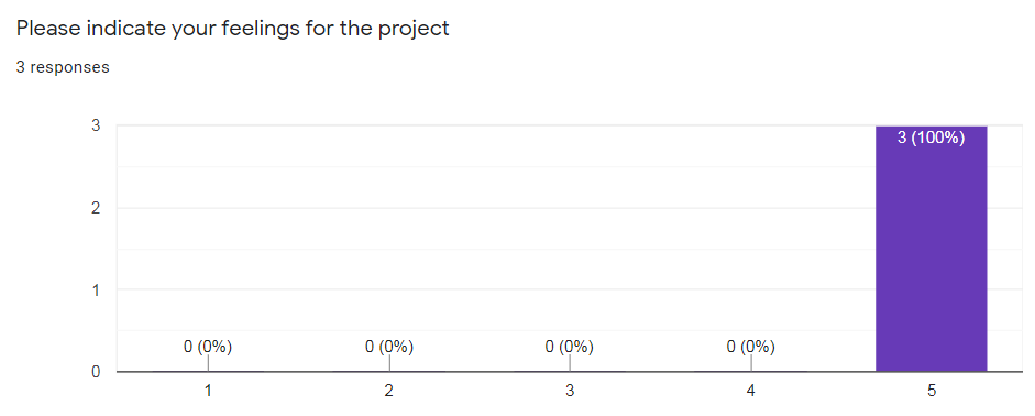
Looking back, I don't particularly like this question. It wasn't granular enough in my mind, as 1 was simply 'not interested', and 5 was simply 'interested'. I think in future questionnaires, it would be better to have a more granular scale so that more varied responses may be more easily seen.
Question 10

I fully agree with the idea proposed by the response at the bottom, as once the icons for the abilities are present, it is hard to distinguish which arrow key they belong to by the arrow icon as it is largely obscured, and instead relative positioning must be used to determine which arrow it belongs to. While this isn't too much of a hurdle to overcome for the user, it is an unneeded piece of "friction" in my opinion, and should be remedied in future development.
Get Noiromancy
Noiromancy
| Status | In development |
| Author | hellmage20 |
| Genre | Platformer |
More posts
- Documentation + User GuideOct 17, 2021
- User Interface / PolishOct 16, 2021
- InteractionSep 26, 2021
- Level BlockingSep 19, 2021
- Basic MovementSep 12, 2021
- Game ConceptAug 29, 2021
Leave a comment
Log in with itch.io to leave a comment.